




Vintage Wall Cartography
Vintage wall cartography brings historical maps into modern interiors, offering framed county plans, town views and world sheets from past centuries.
Vintage Wall Cartography
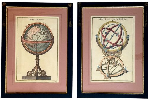
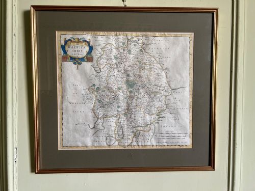
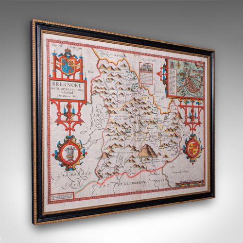
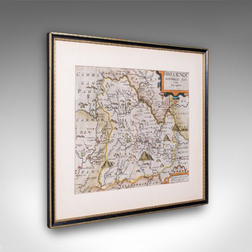
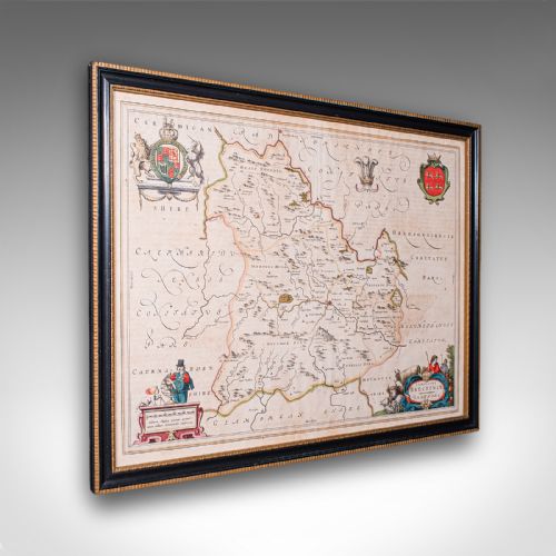
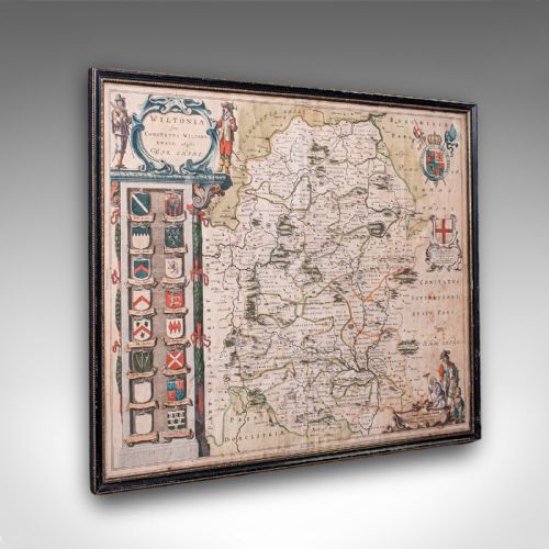
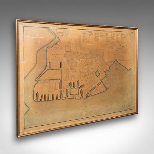
Vintage wall cartography encompasses framed paper sheets detailing counties, countries and towns, produced across the seventeenth, eighteenth and nineteenth centuries. These works include county maps by cartographers such as John Speed and Robert Morden, alongside town plans and regional charts.
The selections available lean heavily towards seventeenth-century county map engravings and Georgian atlas sheets, often mounted behind glass in wooden or gilt frames. Buyers meet English, Dutch and French cartographic traditions, spanning local shire surveys to continental representations of Asia and the Americas.
Framed maps serve both as historical reference material and decorative wall art, bringing tangible antiquity into domestic spaces. The predominant forms are single or dual-sided paper engravings, frequently bearing contemporary hand colouring and descriptive text on the reverse.
Assessing Quality and Execution
The standard of an engraved map rests upon the clarity of the printed line and the precision of the plate impression. Finer examples retain crisp typography and sharp cartographic details without blurring or ink bleeding into the paper fibres.
Hand colouring introduces another distinction, where skilled application of watercolour elevates the visual depth of regional boundaries and decorative title cartouches. The integrity of the original paper sheet, together with period framing elements, shapes the overall character of the piece.
Vintage Wall Cartography Retail Price Guide 2026
Typical asking prices for vintage wall cartography among the pieces listed under this phrase on Sellingantiques today, from the lower quarter to the upper quarter. They describe what is for sale here now, not the wider market.
The inventory spans seventeenth-century Dutch cartography, Georgian atlas engravings and Victorian town plans.
John Speed·Robert Morden·Joan Blaeu·Johannes Janssonius·Emanuel Bowen
The Vintage Wall Cartography Glossary
- Cartouche
- A decorative frame or tablet enclosing the title, scale, and maker's details on a map. They often feature heraldic beasts, foliage, or figures reflecting the region depicted.
- Atlas
- A bound collection of maps, though many surviving sheets have been removed and framed individually for wall display. These volumes were produced across Europe by major publishing houses.
- Dual Sided
- A paper sheet bearing printed cartography and descriptive text on both the front and back. This format is common in seventeenth-century county atlases.
- Town Plan
- A detailed street-level map focusing on urban layouts, docks, or fortifications rather than wider regional geography. They offer insights into historical civic development.
- Hand Coloured
- Paper engravings enhanced with applied watercolour pigments after printing. This process was often undertaken by contemporary workshops to increase visual appeal.
Vintage Wall Cartography: Frequently Asked Questions
How should I hang vintage wall cartography safely?
Keep framed maps away from direct sunlight and damp walls to protect the paper and watercolour pigments from fading or moisture damage. Use sturdy picture hooks suited to the weight of the wooden or gilt frames.
Ensure the hanging height places the centre of the map at eye level for comfortable viewing. Professional framing with acid-free backing materials helps preserve the paper over time.
What is the difference between county maps and world maps?
County maps focus on local shires and regional landmarks, frequently produced for historical British atlases by makers like John Speed. They provide detailed parish names, local topography and decorative coats of arms.
World or continental maps cover much broader geographical areas, reflecting the evolving global knowledge of European mapmakers. These larger sheets often depict conjectural coastlines and foreign territories alongside ornate cartouches.
How can I tell a seventeenth-century map from a later copy?
Examine the paper texture, plate marks and typography closely under magnification to identify period printing characteristics. Seventeenth-century impressions typically display distinct plate indentation lines and laid paper with visible chain lines.
Check the linguistic style and spelling on the sheet, as place names and Latin text often reflect the specific publishing period. Contemporary hand colouring also differs from modern digital reproduction techniques used in facsimile prints.
Why do some maps have text on the back?
Many early atlases printed descriptive historical or topographical text on the reverse of the map sheet to accompany the visual geography. This dual-sided format is characteristic of seventeenth-century productions.
When framed, only the front face remains visible, but the presence of text on the reverse confirms the authentic book leaf origin of the piece.