




Earthen Tone Oil Painting
An earthen tone oil painting brings quiet warmth and depth to a room through muted pigments and brushwork.
Understanding Earthen Tone Oil Paintings
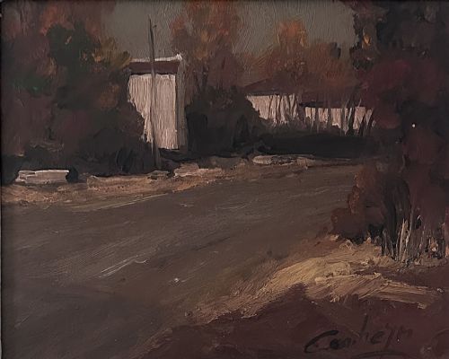
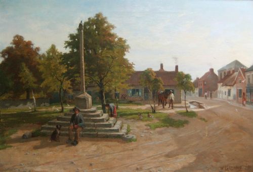
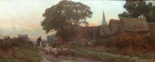
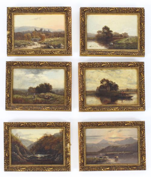
An earthen tone oil painting captures landscapes, classical scenes, and domestic interiors using a palette of natural, muted pigments. These works draw the eye with subtle browns, ochres, greens, and subdued golds rather than bright primaries.
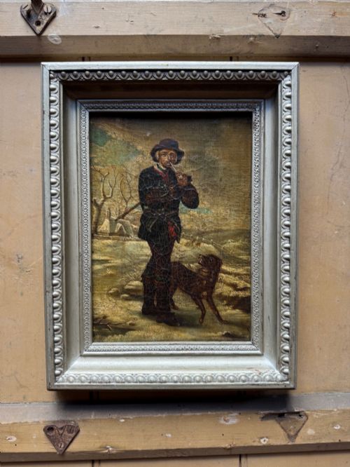
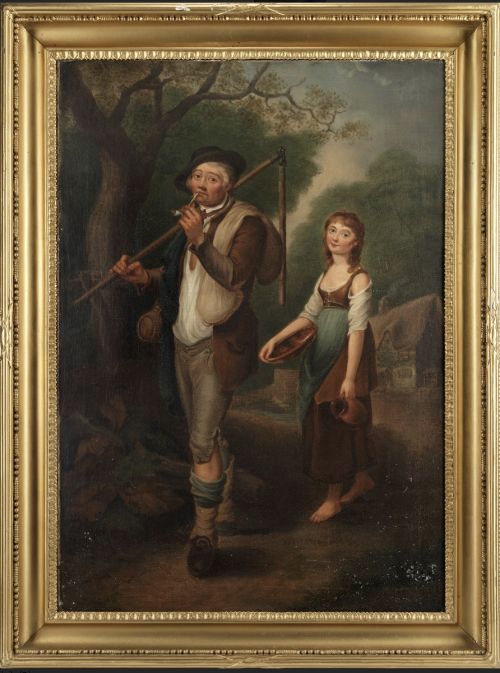
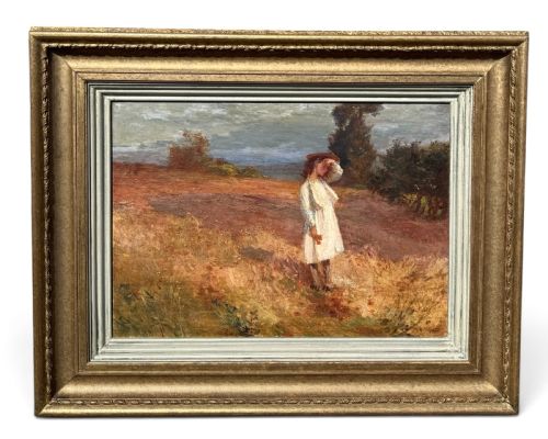
The pieces on this page span several centuries and movements, ranging from classical pastoral compositions to later British Impressionism and Victorian realism. Buyers encounter everything from intimate framed panels to larger canvases depicting rural working life.
Originating from diverse European schools, these oil paintings reflect the shifting aesthetic priorities of the eighteenth, nineteenth, and early twentieth centuries. Each canvas records a specific landscape or interior through the restrained colour choices favoured by the artist.
Materials and Construction
Artists built these works using traditional oil paint applied to woven canvas supports, sometimes set into wooden stretchers. The pigments rely on earth-based minerals which lend durability and stability to the dried paint layer over the centuries.
Many works retain their period framing, constructed from wood with applied gesso and giltwood finishes. These frames provide structural protection while complementing the muted palette of the canvas within.
Retail Price Guide 2026
Typical UK retail prices for earthen tone oil painting, calculated from the Sellingantiques database of over a million retail prices indexed since 2003. This retail price guide relies exclusively on Sellingantiques data; no external sources or auction records are used, so the figures do not describe the wider market.
Current listings feature oil paint on canvas, supported by wooden frames with gesso and giltwood details across multiple centuries.
Assessing Quality and Merit
Quality rests in the assured handling of brushwork and the subtle modulation of tone across the canvas. A stronger piece demonstrates a clear command of light and shadow, creating depth within a restrained colour scheme.
The integration of the painting with its original frame also influences the overall character of the piece. Frames that retain their period gesso and gilding without heavy modern restoration enhance the integrity of the work.
Alphonse Robert·Francesco Zuccarelli·Owen Bowen·Frederick W Jackson·William Greaves·Henry Collins
The Earthen Tone Oil Painting Glossary
- Canvas
- A heavy woven fabric stretched across a wooden frame to serve as a stable support for oil painting. It provides a flexible yet durable surface that accepts multiple layers of pigment.
- Giltwood
- Wood carved and coated with a thin layer of gold leaf or metallic powder. This material is standard for traditional picture framing.
- Gesso
- A plaster-like mixture applied to wooden frames as a smooth base for gilding. It allows for crisp ornamental details.
- Impressionism
- A nineteenth-century painting style focusing on light, atmosphere, and loose brushwork rather than strict academic detail. It appears in several British works from the period.
Frequently Asked Questions
Where should I hang these paintings?
Muted oil paintings suit rooms with stable humidity and indirect natural light. Direct sunlight fades historical pigments and stresses the underlying canvas and wooden frame.
Interior walls away from direct heat sources protect the paint from cracking. A secure picture hook sized for the weight of the frame ensures safety.
How do I identify the period?
Dating relies on stylistic evidence, stretcher construction, and framing materials. Eighteenth-century works often feature classical compositions, while nineteenth-century pieces show greater realism or impressionistic brushwork.
Signatures, inscriptions on the reverse, and historical labels offer further clues. Comparing the canvas weave and nail types helps confirm the era.
Why use earth tones?
Artists employed natural earth pigments to achieve realistic, harmonious depictions of landscapes and interiors. These colours create a sense of calm and visual balance within a composition.
Subdued palettes reflect the prevailing aesthetics of classical and realist schools. They allow subtle shifts in light to carry the emotional weight of the scene.