



18th Century Watercolour
These 18th century watercolour paintings bring historical landscapes, portraiture and classical subjects to rooms through delicate pigment on paper.
The scope of these works
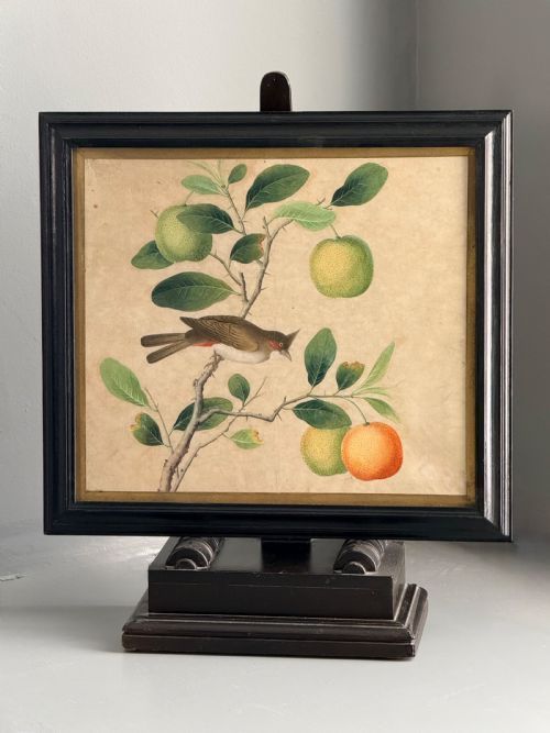
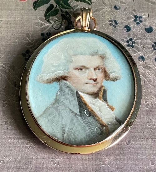
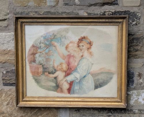
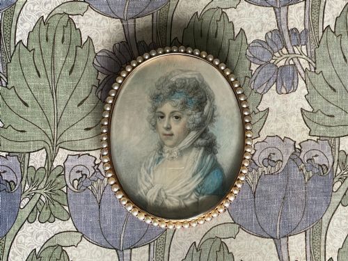
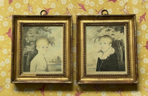
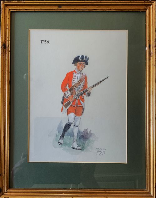
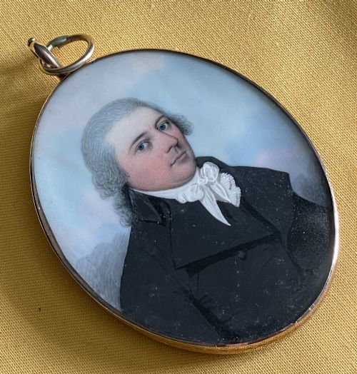
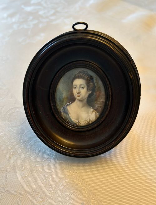
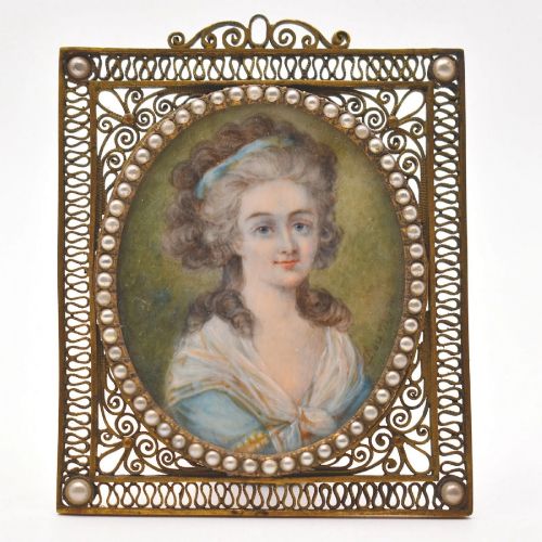
An 18th century watercolour encompasses delicate works on paper spanning British and European landscapes, classical mythologies, genre scenes and portraiture. Buyers encounter architectural studies, topographical views of castles and abbeys, naval seascapes, and intimate miniature portraits.
The English School dominates the selection, alongside Dutch school pieces, French Neoclassical works and Indian paintings. Subjects range from romantic moonlight lake scenes and dramatic ruins to theatrical caricatures and pastoral cattle landscapes.
Materials and technique
Artists worked primarily with watercolour and ink applied to paper or card, occasionally employing grisaille monochrome pigments. Works often combined ink line work with transparent watercolour washes to build depth and form.
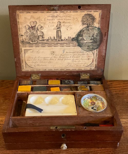
Framed examples utilise wood frames paired with glass for protection, while surviving materials include period paint boxes and piano key frames for miniatures.
Retail Price Guide 2026
Typical UK retail prices for 18th century watercolour, calculated from the Sellingantiques database of over a million retail prices indexed since 2003. This retail price guide relies exclusively on Sellingantiques data; no external sources or auction records are used, so the figures do not describe the wider market.
An 18th-century paint box reminds us that creating these delicate blues and greens involved grinding minerals by hand.
Distinctions in execution
Quality rests upon the sureness of the underlying ink sketch, the subtlety of the wash transitions, and the expressive handling of figures or architecture. Superior examples display confident brushwork and atmospheric depth rather than rigid, mechanical illustration.
Works attributed to notable hands or specific regional schools demonstrate greater compositional ambition, while handling of light and shadow distinguishes accomplished topographical and portrait studies from routine sketches.
Edward Dayes·J Laporte·Samuel Hieronymus Grimm·Pio Panfili·Sir Joshua Reynolds·Miss Anne Williams·Francis Wheatley·Nicholas Pocock·Angelica Kauffman·Samuel Scott·JC Janson·Francis Swaine·William Bielby·Reeves and Inwood·G Vonk·Thomas Gainsborough·Richard Cooper Jnr·Thomas Walmsley·John Nixon·Mary Milner·John Downman·Cosway
The 18th Century Watercolour Glossary
- Grisaille
- A painting executed entirely in shades of grey or neutral monochrome. This technique was frequently utilised for preparatory studies or architectural renderings.
- Topographical
- Depicting specific real places, buildings or landscapes with descriptive accuracy. These views record historical geography and architecture.
- Wash
- A thin, semi-transparent layer of diluted watercolour or ink spread across paper. It creates smooth backgrounds, skies, and shadows.
- Miniature
- A small-scale portrait painting executed with fine detail. These works often feature oval formats and specialised framing.
- Genre scene
- A painting depicting aspects of everyday life by representing ordinary people caught in common activities. Such works offer glimpses into domestic and social history.
Frequently Asked Questions
What subjects appear most often?
British and European landscapes form the largest category, featuring lakes, castles, abbeys, and country houses. Architectural studies and picturesque views of rivers and mountains also recur frequently.
Portraiture represents another major group, ranging from miniature oval profiles to finished studies of women and family genre scenes.
How were these paintings displayed originally?
Works on paper were typically mounted, matted, and placed behind glass within wooden frames to protect the delicate pigments from dust and moisture. Miniature portraits often featured specialised surrounds such as piano key frames.
Many smaller sketches and washes were also kept bound in albums or portfolios rather than hung permanently on walls.
How do I care for an 18th century watercolour?
Keep works away from direct sunlight and bright artificial light, as 18th-century pigments fade rapidly under ultraviolet exposure. Maintain stable indoor humidity and temperature to prevent paper degradation and foxing.
Ensure framing uses acid-free materials and that the glass does not touch the surface of the paper directly.
How can I distinguish period styles?
Georgian and picturesque landscapes emphasise dramatic ruins, romantic moonlight, and natural topography with ink and wash. Neoclassical works focus on classical figures, mythology, and balanced composition.
Brushwork, palette choices, and handling of atmosphere offer further clues to whether a piece belongs to the English School, Dutch school, or French traditions.