
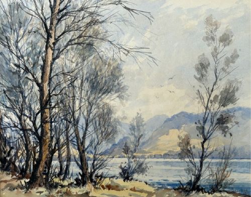
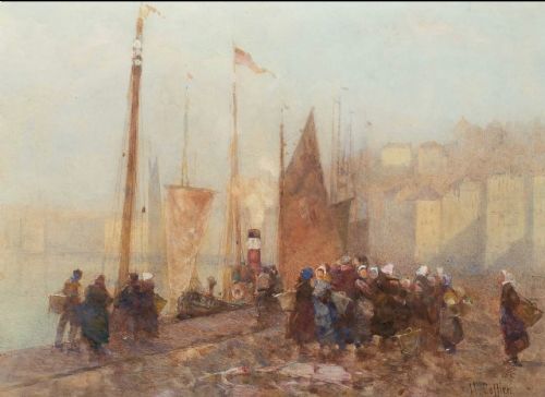
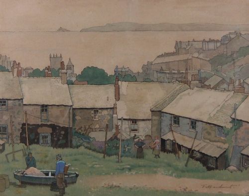
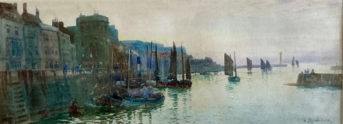
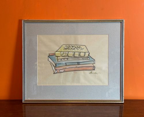

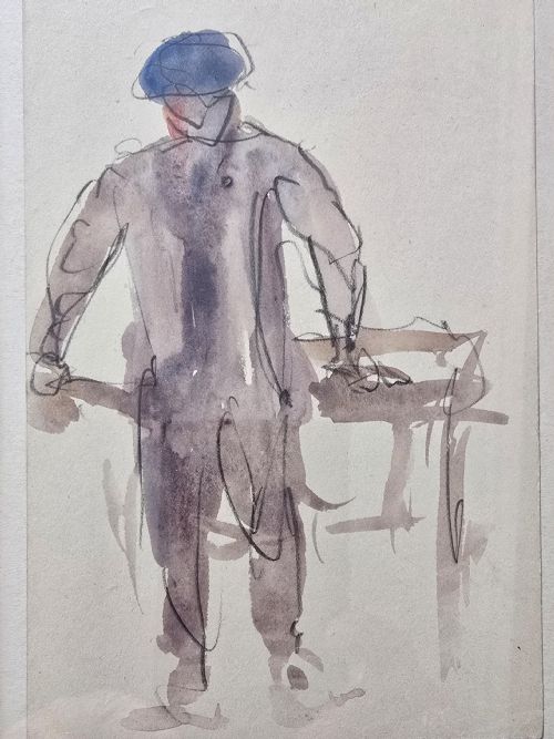
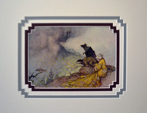


Grey Paper Watercolour Artwork
Grey paper watercolour artwork brings a distinct tonal depth to traditional painting, using the mid-tone ground to let highlights and shadows work together.
Grey Paper Watercolour Artwork
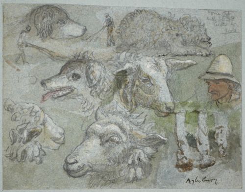
A grey paper watercolour artwork utilises the tinted support as an active middle tone, rather than treating the paper merely as a blank white surface. Painters apply washes and body colour so that the exposed paper acts as the shadow or mid-tone, adding immediate atmosphere to the scene.
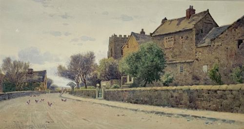
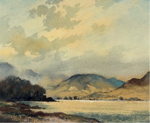
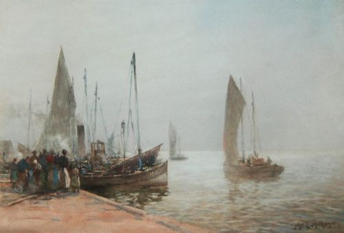
The selections available range from 19th-century Victorian coastal scenes and landscapes to mid-century modern sketches and architectural studies. British artists predominate, capturing landscapes from Yorkshire, the Lake District and maritime harbours.
Works appear in various forms, including framed paintings, fine art watercolours, and ink sketches on paper. Many carry signatures from regional British painters working through the Edwardian era and the early decades of the twentieth century.
How they were made
Artists combined watercolour pigment and ink on paper, often employing opaque body colour such as white gouache to build bright highlights against the grey ground. The absorbent nature of the paper allowed washes to settle quickly, fixing the tone of the sketch.
Framed behind glass with wood surrounds, these works were preserved from atmospheric moisture that damages unprotected works on paper. The choice of grey paper provided a ready-made middle tone that saved time when sketching outdoors in changing light.
Current listings feature watercolours spanning the 18th century, Victorian period, Edwardian era, and mid-20th century.
What varies in quality
The success of a grey paper watercolour artwork rests on the artist's handling of the middle tone, where restraint in adding highlights preserves the luminous quality of the paper. Stronger pieces demonstrate confident brushwork that defines form with minimal intervention.
Condition varies according to exposure to light, as fugitive pigments and unsealed paper can fade or tone unevenly over decades. Stronger examples retain their original contrast between the dark ink lines, pigment washes, and the cool grey ground.
James Smetham·John McDougal·Robert Leslie Howey·James E. Aitken·Hector Caffieri·Thomas Maidment·William Matthison·Cecil Beaton·Albert Ludovici Jnr·Michael Healy·Warwick Goble·Commander Eric Tufnell·Fred Lawson·Arthur Reginald Smith·Cuthbert Crossley·Thomas Bush Hardy·Edward Seago·Tom Clough·Rowland Henry Hill·Stanley Orchart·Edward Dayes·Florence Hess·John Augustus Atkinson·Henri Joseph Harpignies·Frank H. Mason
The Grey Paper Watercolour Artwork Glossary
- Body colour
- Watercolour pigment mixed with a dense white base to create opacity, allowing artists to paint highlights over darker paper grounds.
- Wash
- A fluid application of diluted watercolour pigment spread evenly across the paper to create broad areas of tone or sky.
- Ground
- The foundational surface preparation or tinted paper upon which the primary watercolour and ink drawing is executed.
- Support
- The physical material, in this case paper, that holds the watercolour pigment and ink marks of the finished artwork.
Grey Paper Watercolour Artwork: Frequently Asked Questions
What is grey paper watercolour artwork?
These pieces are paintings and sketches executed on tinted grey paper rather than standard white stock. The coloured ground serves as a middle tone that unites the composition.
Artists use this technique to capture atmospheric effects quickly, allowing the paper to act as shadows or mid-tones.
How should I frame grey paper art?
Watercolours on paper require framing behind glass with acid-free mounts to prevent direct contact with the glazing. This protects the delicate pigments from moisture and environmental damage.
Keep framed works away from direct sunlight to prevent the grey paper and pigments from fading over time.
Which periods do these pieces date from?
The selections span from the eighteenth century through the Victorian and Edwardian eras into the mid-twentieth century. Early examples often depict topographical views, while later works lean toward impressionistic landscapes.
Dates can be verified through signatures, stylistic markers, and period framing materials associated with British regional artists.
How do I identify different regional styles?
British regional artists often focused on local coastal harbours, industrial towns, or rural dales using rapid watercolour washes and ink. Comparing the subject matter to known localities helps attribute the work.
Signatures and exhibition labels on the reverse of the frame provide further context regarding the artist's school and working period.