



Paper Ink Landscape Illustration
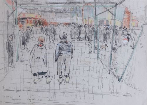
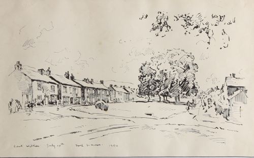
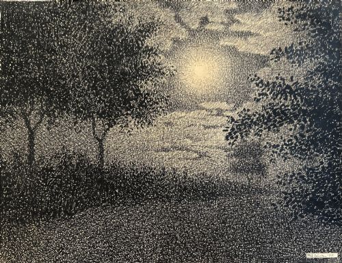
These paper ink landscape illustration works capture scenery through line and wash, offering intimate views suited for quiet study.
Paper Ink Landscape Illustration
When you search for paper ink landscape illustration, you find works on paper spanning the eighteenth, nineteenth and twentieth centuries. These pieces record rural views, townscapes and architectural settings through drawing and painting.
You are most likely to meet twentieth century British examples on this page, alongside earlier Georgian and nineteenth century pieces. The selection includes works framed in glass and wood, featuring media such as watercolour, pencil and gold leaf.
The subjects range from Scottish Arts and Crafts compositions to English regional scenes and specific locations like the English Lake District. Each drawing preserves a topographical record or an artist's direct observation of the countryside.
Materials and technique
The foundation of these works relies on paper supports combined with ink lines and wash techniques. Artists applied pen and ink to define structure before adding watercolour or pencil shading to build depth.
Some examples incorporate gold leaf details or are presented behind glass within original frames. The integration of monochrome ink with fluid washes creates contrast between sharp outlines and softer atmospheric effects.
Paper Ink Landscape Illustration Retail Price Guide 2026
Typical asking prices for paper ink landscape illustration among the pieces listed under this phrase on Sellingantiques today, from the lower quarter to the upper quarter. They describe what is for sale here now, not the wider market.
Fred Lawson walked the Yorkshire dales with his sketchbook, recording village carts and castle walls while stopping to chat with farmers.
Judging the work
Quality rests upon the sureness of the hand and the clarity of the line within the ink work. A confident pen stroke maintains vitality across the paper, whereas hesitant drawing flattens the landscape.
The relationship between the ink framework and the watercolour wash determines the visual balance of the composition. Skilled handling preserves the crispness of the drawing beneath the transparent layers of colour.
Fred Lawson·Edward Dayes·Peter Tillemans
The Paper Ink Landscape Illustration Glossary
- Wash
- A thin, transparent layer of diluted ink or watercolour applied across the paper to create tone or shadow. It provides depth behind the sharper pen lines.
- Topographical
- Depicting specific real places, buildings or landscapes accurately rather than inventing an imaginary scene. Many landscape drawings serve as historical records of villages and terrain.
- Gilt frame
- A wooden picture frame coated with gold leaf or metallic paint. These frames protect the work behind glass and reflect the period of presentation.
- Support
- The physical material upon which the artwork is created, in this case paper. The weight and texture of the paper influence how well it accepts ink and watercolour.
Paper Ink Landscape Illustration: Frequently Asked Questions
How do I care for paper ink landscape illustration?
Keep these works away from direct sunlight to prevent the ink and watercolour pigments from fading over time. Maintaining stable indoor humidity protects the paper support and the wooden or gilt frame.
Ensure the glass is clean and that the backing board inside the frame is acid free. Proper framing safeguards the delicate surface from moisture and environmental damage.
Are these works original drawings?
Yes, the selection consists of original hand drawn and painted works rather than printed reproductions. Each piece shows the direct application of pen, ink and brush by the artist.
Close examination reveals the texture of the paper and the individual pen strokes within the landscape. These unique characteristics distinguish original drawings from mass produced prints.
How are periods identified?
Periods are determined through stylistic markers, framing methods, paper types and documented artist signatures or attributions. Georgian works often display specific handling of ink and wash distinct from twentieth century British pieces.
Inscribed titles and dates on the mounts or reverse sides also provide clear evidence of when the artwork was created. Comparing the lettering style helps confirm the era.
Where should I hang these pieces?
Hang them in interior spaces with indirect lighting, such as studies, hallways or living rooms. Their modest scale suits intimate wall spaces where viewers can examine the fine ink details closely.
Pairing a framed drawing with similar period works creates a cohesive display that highlights the varied approaches to landscape depiction across different centuries.